




Web design has never been static terrain, but 2026 is turning out to be a particularly fascinating year. We’re seeing a paradigm shift: AI has stopped being an auxiliary tool and become an engine of personalization and efficiency. And, perhaps as a reaction to that algorithmic perfection, we’re also seeing a strong return to the human, to imperfection and to experiences that truly connect with the people who use them.
These five trends aren’t fads from a Dribbble cycle — they reflect deep changes in technology and in what users expect from a site.
1. AI as an engine of personalization and efficiency
AI went from being a futuristic concept to an everyday presence in the design process. It’s no longer just about generating images: it’s about creating hyper-personalized experiences. Sites have stopped being static — they adapt in real time to the visitor’s behavior, location and even context.
Personalization goes beyond recommending products: a site can change its palette according to the local weather, or adjust its calls to action based on the user’s previous interactions. And AI tools make this accessible even to small businesses, without needing a huge development team. This changes the designer’s role: instead of executing every piece by hand, their job becomes defining the strategy and judgment behind what the AI generates — working in collaboration with the machine, not just using it as a passive tool.
2. Glassmorphism and “calm futurism”
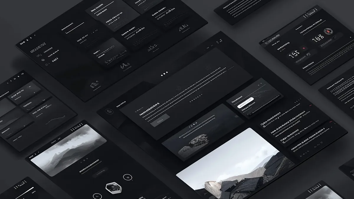
At the visual end of the spectrum, Glassmorphism has established itself as the aesthetic language of the moment. It isn’t the cold minimalism of past years, but an evolution that creates a sense of depth and lightness with a futuristic, pleasant touch: transparent frosted-glass layers, glows and shadows that bring modernity and sophistication.
In an increasingly saturated digital world, Glassmorphism offers a way to stand out with a visual identity that feels innovative and approachable at the same time.
3. The return of the human: Refined Brutalism and Creative Process
In the face of AI’s uniformity, 2026 design also celebrates imperfection and the handmade. Styles like Refined Brutalism and Creative Process are growing, embracing the “ugly”, the chaotic and the unfinished as a statement of intent.
Refined Brutalism uses huge typefaces, intense colors and asymmetric layouts to make an impact without leaving people indifferent — but always with usability in sight. Creative Process, on the other hand, shows hand-drawn sketches, scanned textures and collages, celebrating the creative process and the human connection behind a polished digital product. It’s a way of building trust by telling a more authentic story.
4. Micro-interactions and motion with purpose
Purely decorative animations are a thing of the past. In 2026, motion has a clear purpose: to guide the user and create a memorable experience. Motion Narrative turns navigation into a story, where scrolling and animations are part of the design, not an add-on.
Micro-interactions —the subtle bounce of a button, the tactile response of a form— are now considered essential elements, the ones that separate a functional site from an unforgettable one. That said, motion has to be implemented carefully: respecting the user’s accessibility preferences (prefers-reduced-motion) and without sacrificing performance — nothing kills a good animation faster than jank, the perceptible visual stutter.
5. Typography as the visual protagonist
Typography has stopped being a simple vehicle for text and become the main visual anchor of many pages. 2026 designs rely on huge, expressive typefaces, often combining variable fonts that adapt fluidly to create immediate impact.
It’s not just aesthetic — it’s also functional. A variable font (a single file with multiple weight and width variations) reduces load time compared with loading several static fonts, a direct advantage in performance and SEO. The result: headlines become the most distinctive element of the page, replacing photography in some cases as the main means of visual communication.
No trend replaces a solid content strategy. They’re the visual layer on top of a foundation that has to be solved before you touch Figma.
It’s not about adding all five trends at once, but about choosing the ones that serve the business goal and each brand’s identity — with usability, performance and accessibility as pillars that aren’t negotiable.