




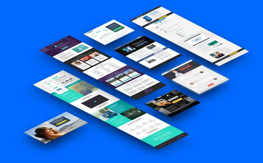
There’s an enormous difference between sending traffic to your home page and sending it to a landing page. The home page invites people to explore. A landing page, on the other hand, has a single purpose: getting the visitor to do exactly what you want them to do. Buy, subscribe, request a quote or leave their details.
That difference, however small it may seem, separates a campaign that generates results from one that just piles up clicks with no return.
What exactly is a landing page?
A landing page is a standalone web page designed for a marketing campaign, with a single conversion goal and no distractions that pull the visitor away from it.
The name comes from its function: it’s where the user “lands” after clicking a Google ad, a social media link or an email. Instead of arriving at a site with menus, links and many possible paths, they arrive at a page built to guide them toward one action.
The difference from a traditional website isn’t one of format but of intent. A corporate site works like an open-plan office: it shows who you are, what you do, how to contact you, and offers many navigation routes. A landing page is a sales room: it removes everything that isn’t needed to close the deal.
Landing page vs. website: the difference that matters
| Feature | Website | Landing page |
|---|---|---|
| Goal | Multiple: inform, sell, build brand, rank in search engines | Single: one specific conversion |
| Navigation | Full menu with several sections | No menu, or a minimal one, to avoid distractions |
| Links | Internal and external links that invite exploring | Only the ones needed to convert |
| Content | Rich and varied, built to generate authority and rankings | Direct, focused on the value proposition and the action button |
| Visit | Free exploration | Quick decision |
| Lifespan | Permanent, constantly updated | Tied to a specific campaign |
Mixing up the two formats is one of the most common reasons campaigns don’t convert. Sending ad traffic to the home page is like inviting someone to dinner and handing them the whole restaurant menu instead of the dish you wanted them to try. If what you’re after is a one-page site that works as a business card, that’s a different format: we explain it in What is a Onepage.
Types of landing pages by goal
They don’t all pursue the same thing. The structure, the copy and the design depend on the conversion you’re after:
- Lead generation. The visitor leaves their details in exchange for something of value: a guide, a demo, a template or access to a webinar. The form is the star.
- Direct sales. Built to close an immediate purchase. It includes detailed product information, benefits, testimonials and a prominent buy button.
- Sign-up or subscription. For registering for an event, a newsletter, an app or a service. The focus is on explaining the benefit in a few lines and reducing form friction.
- Click-through (bridge). It doesn’t aim for the immediate conversion, but to prepare the user for the next step: taking them to checkout or to a longer form.
- Thank-you. Appears after the action is completed. It confirms the conversion and often offers additional content or related products.
The elements every effective landing page needs
A landing page isn’t a pretty page with a button: it’s a structure designed to guide the visitor toward action. These are its essential components.
- Clear, benefit-oriented headline. It’s the first thing people read and it has to answer in seconds: what do you offer and why should I care? Generic headlines don’t convert; specific ones do.
- Value proposition. Describing the product isn’t enough: you need to explain why it’s different and why someone should choose you over the competition.
- Call to action (CTA). The button that closes the deal. It has to be visible, contrast with the rest of the design and describe the benefit, not the mechanical action: “I want my free trial” converts better than “Submit”.
- Form. If the goal is to capture data, ask only for what’s essential. Every extra field is a barrier. Name and email are usually enough to start. We cover how to build it properly in What is web usability.
- Social proof. Testimonials, reviews, client logos and usage figures. Trust is a prerequisite for converting, especially with cold traffic that doesn’t know you.
- Relevant images or videos. Real photos of the product or service in use, not generic stock images. Visitors need to see themselves using what you offer.
- Loading speed. The slower the page, the more people leave before seeing your offer. If yours is slow, start with My website is slow: what can I do?.
How to measure whether a landing page works
The main metric is the conversion rate: the percentage of visitors who complete the desired action. You calculate it by dividing conversions by visitors and multiplying by 100.
There’s no “good” rate for every case. It depends on the industry, the type of traffic and the specific action: asking for a quote demands far more from the visitor than subscribing to a newsletter. That’s why it’s better to compare yourself with your own history than with other people’s averages.
Other metrics that help you understand what’s going on:
- Bounce rate: if it’s high, the page isn’t delivering what the ad promised.
- Time on page: a very short time points to a lack of interest.
- Clicks on the main button: they measure how effective the call to action is.
- Form completion: if many people start and few finish, it’s too long or confusing.
A landing page isn’t finished the day it’s published: it’s the first version of something that improves with every piece of data it collects.
If you’re about to launch a campaign and want the page to be up to it, at Web Design we build it together with the conversion goal, and if you first need a reference for the investment, see How much does a website cost in 2026?.